 (once again, this is a response to DC's post below, but I still don't know how to put pictures in a response)
I used to joke that PowerPoint was great if you only had ten minutes to put together a two hour presentation.
However just because you can be simple in PPT, doesn't mean you have to.
Moreover, homework and reports should be visual as often (if not more) than a stream of text. Visual work is often more rigorous, more succint, more complete, more challenging to authors, and better able to present interesting systems/relationships. I even hope visual content creators will think in terms of situational awareness and available options, whether for a historical figure or a potential customer.
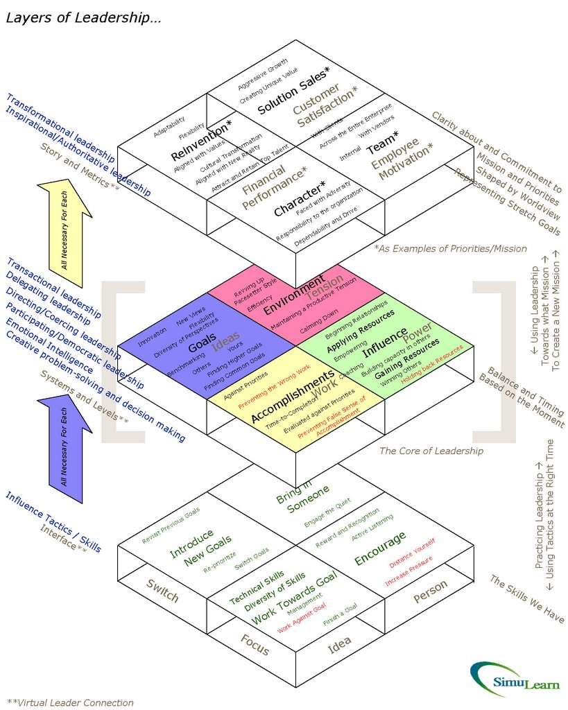
Here are some more dense charts I have created (and I apologize for the repeats for long terms readers of the blog).
And techincally, I have found that PowerPoint is a very good authoring environment for producing charts that, as long as there are no pictures, are small (in size) when embedded in Word, and looks great when converted to a pdf.


2 comments:
Clark, I love some of your diagrams. The circular chart is one of my all-time favorites. However, posting postage-stamp sized diagrams with no link to the original is not user-friendly.
Here's a code-free way to insert clickable graphics. Get a free account at flickr.com. Upload your images. Click the All Sizes button. Select the size you want. Copy the code that appears under the photo and paste it into the blog or webpage. Bingo. You have a thumbnail that links back to the original.
Thanks, Jay. Done. They really should be in PowerPoint, in which they are very small and very clear, but ah well.
Post a Comment